The original SQLFluff logo was designed over five years ago, in fact you can read about the original design process here:
After all that time, things had got a little stale. Specifically:
- The fuzziness around the “Fluff” had always been uneven, and rendered pretty poorly on different displays.
- The contrast was poor on darker backgrounds, making dark modes tricky.
- The overall look wasn’t very polished, and just needed a refresh.
However, having been down this road a few times in the past (including getting some people on Fiverr to redesign it a few times), the overwhelming feedback from the community was not to change it too much. The logo is recognisable, and generally liked - so there’s no point getting people used to an entirely new logo.
Therefore the aim is: same same but different 🤷.
Side by side comparison#
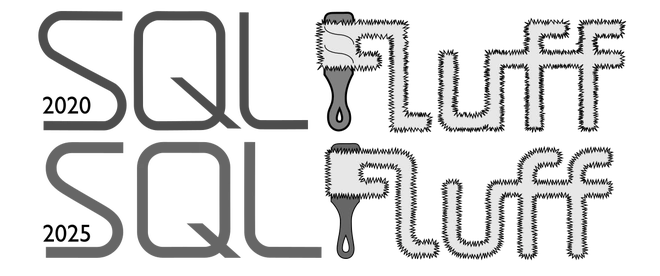
As you can see, it’s still recognisably the same, however there’s some key differences:
- There’s one less shade of grey. Previously, the handle of the lint roller (i.e. the “F”) was a darker grey than the “SQL”. In the new version, they’re the same. The resulting shade is pretty close to the original handle colour, and lighter than the original “SQL” text, which gives much better contrast on a dark background.
- The “SQL” text is thicker, and the stalk of the “Q” is shorter. Again this is primarily to increase legibility, both on darker backgrounds, and at smaller scales.
- Less obviously on the “SQL”, I’ve also matched the width of the characters better. Previously the “L” was a bit small compared to the others, and while the “Q” is still wider in the new version, at least the “S” and “L” are at least the same width.
- The handle of the “F” has a slightly simplified profile and a thinner outline. The thickness of the outline is now the same line weight as the “fluffiness”, and the eye of the handle is slightly larger so that the background is visible through it even at smaller sizes.
- The letters of “Fluff” are now curved rather than having sharp corners. There’s a two-fold reason here: the first is that it matches the “SQL” which also had radiused letters, and I’ve intentionally used roughly the same radius. The less obvious reason, is that the fuzziness (which I’ll get to shortly) does some really strange things on sharp corners, and it was hard to get it to render nicely, so reducing the number of sharp corners in the design has an extra upside. Those two reasons also intersect on the base of the “u” which always looked cramped on the old design, and looks more open and less cluttered in the new, simpler, design.
- Finally the “fuzziness” has been totally reworked. In the old design it was distinctly un-even. It was quite loose on the “F” but remarkably dense on the “u”. The reason for this was that it was entirely hand drawn. It took a while to find the right way to ensure consistency, but I eventually found what I was looking for…
Revisiting “fluffiness”#
I’ve been a long time user of Inkscape for most graphic work like this. SQLFluff is an open source project, so it only seems fitting that we’re using an open source vector editor to refresh the logo. The first version of the logo had hand drawn fluffiness which is great to work around corners, but very hard (impossible?) to get something which looks like it has relatively consistent density throughout.
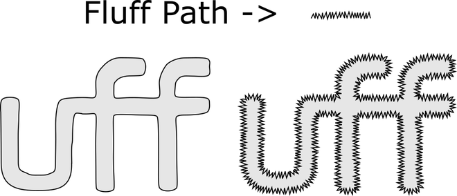
After searching around, I eventually found the “Pattern along Path” feature of Inkscape. This meant I should make a short section of “fluff” which I could ensure was fairly consistent by eye, and then track it along the whole outline of the text shape for a consistent result. I can then adjust the overall shape of the “Fluff” without needing to worry about the density of the fluff changing. Interestingly, the shape which looks “right” with the fluff, looks quite wrong without it, but nobody needs to see the naked text.
Cloning#
The other invaluable Inkscape feature used in this project (although not immediately obvious in the renders) is cloning. This gives the ability to have one “parent” version of a path, which you can then copy into multiple places. The “child” clones then stay in sync so that if the parent is edited, then they also update. This meant I could make all the different variants of the logo (the wide one, the square one, even the website favicon) and then modify the blueprint and see how it affected each one.
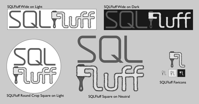
For reference, here’s all the different variants in their new form, which I hope will last at least another five years. The original version took us from around 6k weekly downloads to now being just over 1.5M weekly downloads.
